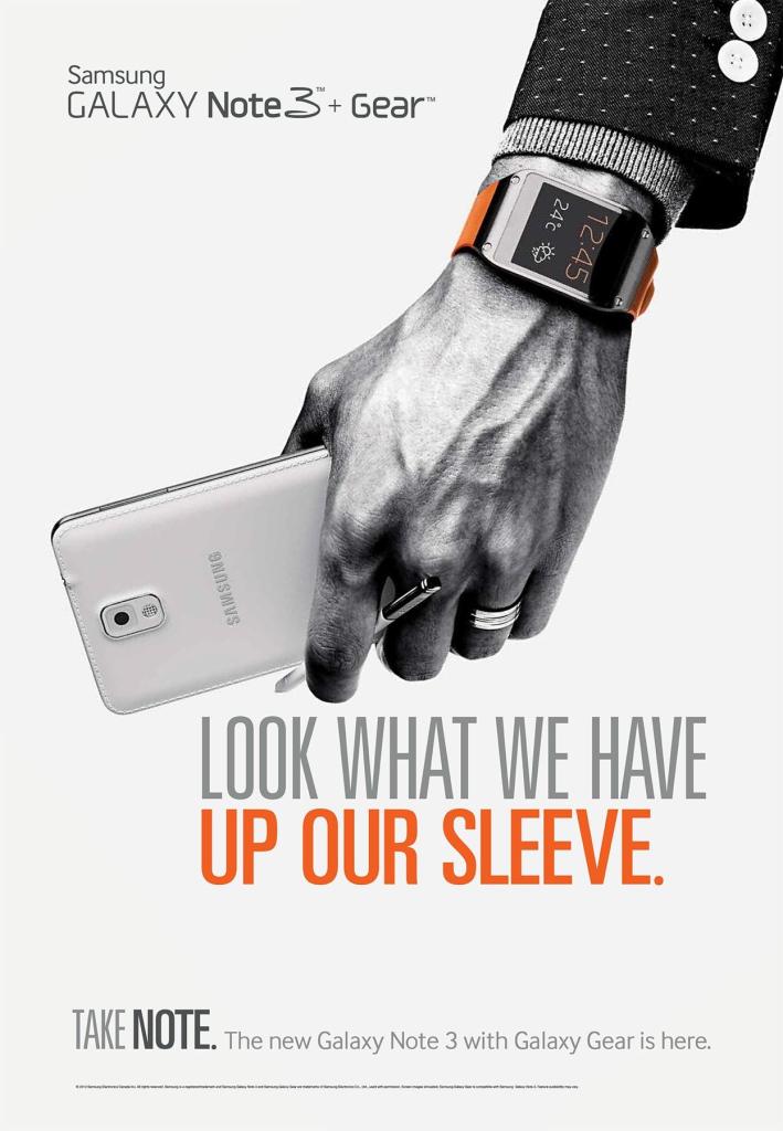
Recently, I’ve been learning about the design principles of contrast, repetition, alignment, proximity, and color. The purpose of this post is to identify how these principles were used effectively in following ad campaign for Samsung’s Galaxy Note 3 + Gear.
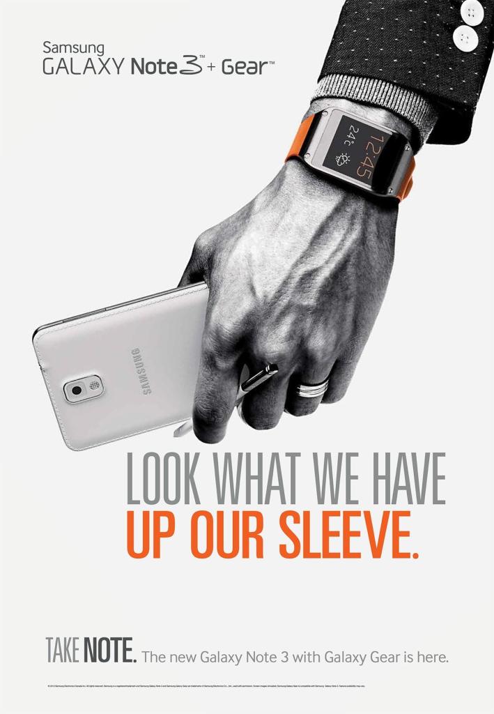
Link: https://www.adsoftheworld.com/media/print/samsung_sleeve
Credits
- Advertising Agency: Cheil, Canada
- Creative Director: Jason Partridge
- Associate Creative Director: Helene Larochelle
- Copywriter: Brook Johnston
- Published: October 2013
Analysis
Contrast
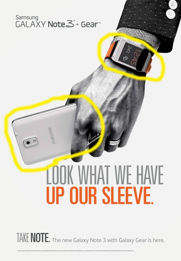
Contrast helps to draw the eye into the image as well as provide a focus. This ad is focused on communicating that there is a new version of the Samsung Galaxy and it can be paired with gear, or, a smart watch. The contrast is found through the color choices. The phone is lightly colored while the watch has a black screen with a bright orange wristband.
Repetition
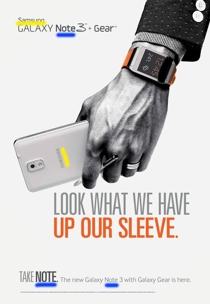
Repetition is used to provide consistency. One way that this ad shows consistency is through repeating “Samsung” and “Note” throughout the piece. Samsung is a recognizable brand, so I liked how they chose to show the name not only at the top where they are announcing a product, but also showing it on the back of the phone. They also repeated the word note in order to help readers remember which version of the product it is. The word, note, appears three times in the ad, twice while naming the product, and once as the tagline “Take Note”.
Alignment
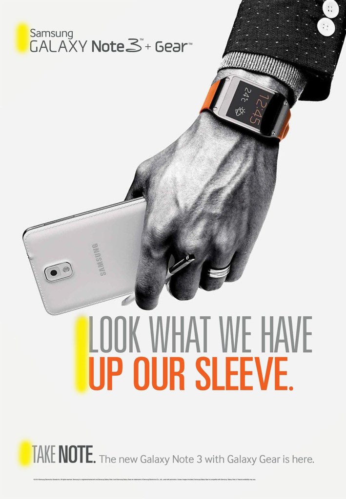
Alignment is used to help create cohesion, and in this ad, they chose to use a left alignment for all of their text. It looks clean, and visually appealing to the readers.
Proximity
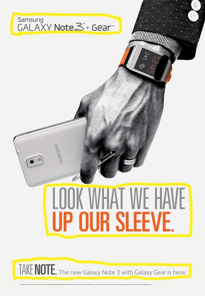
Proximity is used to create relationships through spacing. All of the information that goes together has been grouped together so that the reader is not confused. For example, the phrase “Look what we have up our sleeve” is in two different colors, so it could be thought that they were two separate ideas. However, since the wording is all grouped together, the reader can easily know it is one continuous phrase.
Color
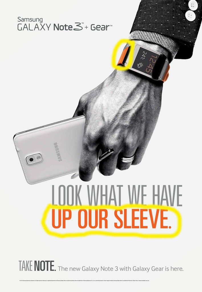
I really liked that the majority of the ad is black and white, but with two pops of orange. The color really draws the reader’s attention to the words up our sleeve, which then makes them look at the wristband on the smartwatch. It’s a great way to promote the “new gear” that can be paired with the Galaxy Note 3 phone.
Conclusion
Following the design principles of contrast, repetition, alignment, proximity, and color really make an ad look cohesive, professional, visually appealing, and easy to understand. I really enjoyed finding this Samsung ad to analyze and was pleased to find that they followed the design principles. This was done through contrasting the color of the phone with the smart watch to draw attention to two new products, repeating the words Samsung and note for brand recognition and to instill the new product name, aligning all of the text to the left, grouping like information together to create a relationship through proximity, and adding the pop of orange to draw the reader in and inform them.