This week, I learned how using correct principles of typography and photography can make a piece look more professional and put together. In today’s post I will be analyzing a magazine spread and how they effectively used typography through identifying the typeface that was used and how they are identified, what elements make the typeface contrasting, and how the photographer used the principle of depth of field in their photo. Then, I will insert three photos that I took that also use depth of field and go along with the theme of the magazine spread.
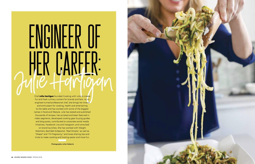
cookingwjulie.com/as-seen-in
Julie Hartigan was featured in the Spring 2018 edition of Where Women Cook Magazine. Photography: Jules Roberts
Analysis
Category of Typeface
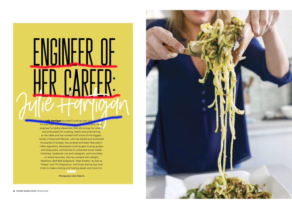
The two types of type that were used in this spread were sans serif (Engineer of Her Own Career:) and script (Julie Hartigan). Sans means “without” in french, so sans serif means without serif. Another identifying characteristic is that there is no visible thick/thin transitions in the strokes of the letters; they are the same thickness all the way around. Script is a typeface that looks like it has been hand-lettered with a calligraphy pen, brush, or sometimes with a pencil.
Contrast
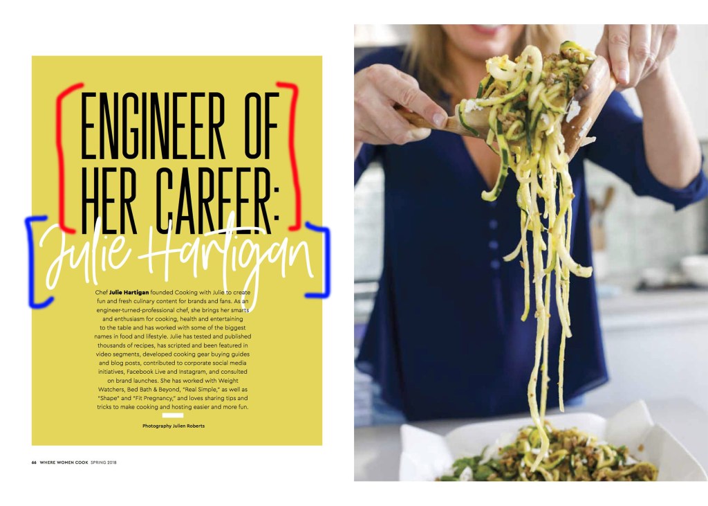
There are six ways to provide contrast in type: size, weight, structure, form, direction, and color. In this magazine spread they used color to provide contrast between the two types. Not only is more visually appealing, it also helps to organize information. Having Julie’s name in white immediately let’s us know that they article is about her.
Photography
Depth of Field
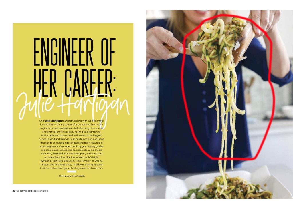
The photographer utilized depth of field in this photo by focusing on the noodles while the background is blurry. This technique helps create layers and transforms the photograph from looking two-dimensional, to having depth.
My Photos
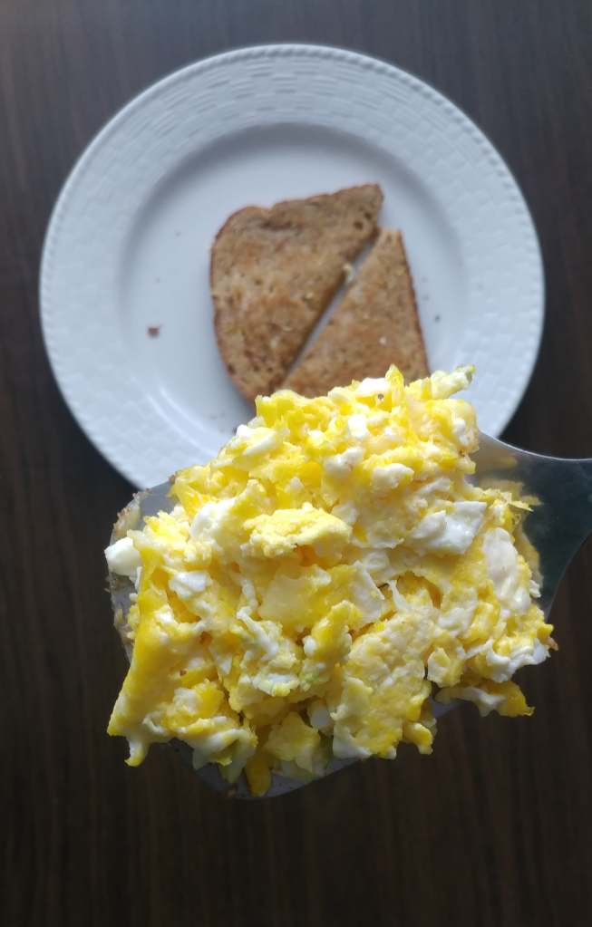
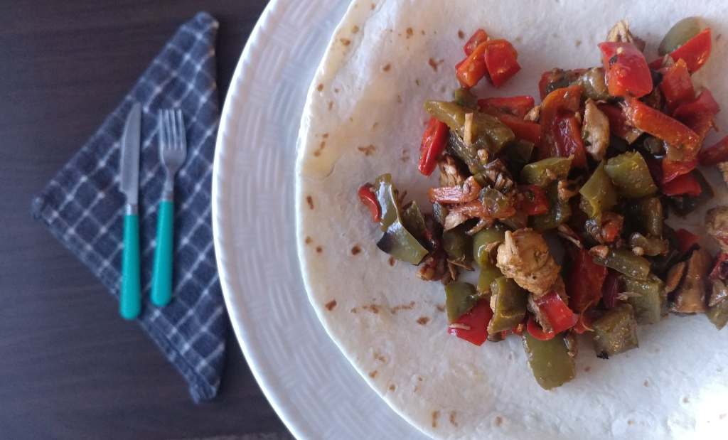
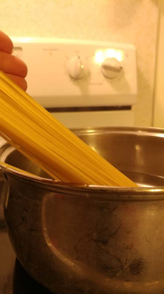
I tried to mimic the photographer’s use of depth of field by focusing on a food item and having the background be blurry. My photos could be inserted into the magazine spread because they are demonstrating cooking meals which is what Julie does for a career.
Conclusion
I was immediately drawn to this magazine spread because it was so visually appealing. Having two different typefaces really made the title stand out and having the contrasting colors helped to organize the information. Using depth of field in the photo drew my eye to the delicious looking noodles as well as made the photo more interesting by adding layers. By having the chance to practice taking my own photos, it really gave me an appreciation for the thought photographers put into their photos.

