This week in my Visual Media class we chose an ad from a well known brand and created our own to accompany it. In this post I will be analyzing both ads to see how the design principles of repetition, color, and typography were followed successfully.
This is the original ad that I chose.

Link: http://creativecriminals.com/print/heinz/sliced-bottle
Credits
- Advertising Agency: McCann, London
- Country: United Kingdom
Analysis
Repetition
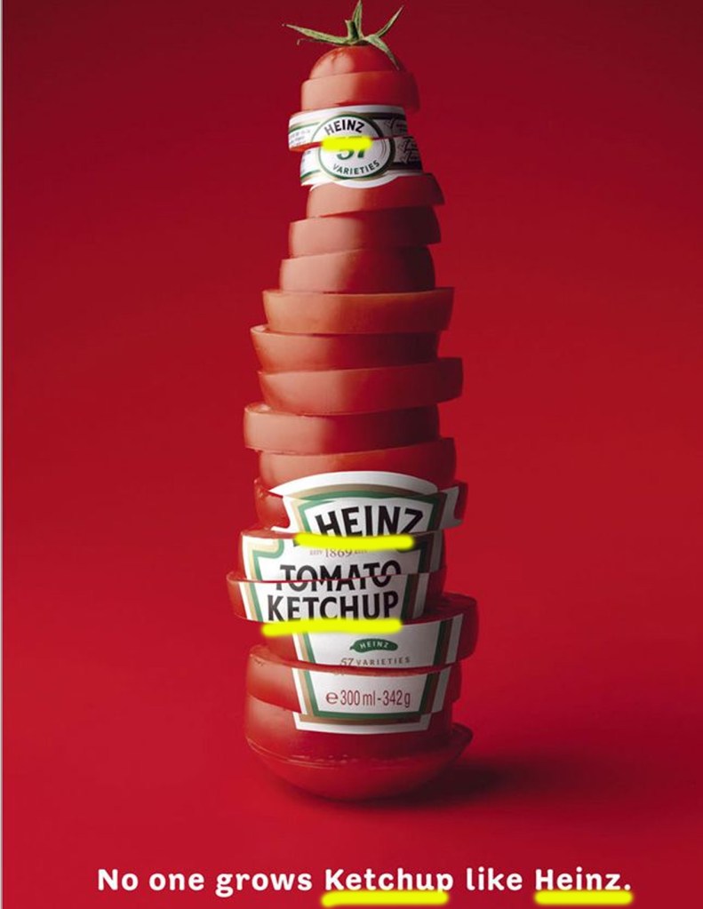
One way that they used repetition was through the words ketchup and Heinz. It’s interesting that while the word tomato and the number 57 are sliced up on the label, ketchup and Heinz are not. The words are repeated on the label and in the sentence at the bottom. I think this was a clever way to get the reader to associate ketchup with their brand Heinz.
Color
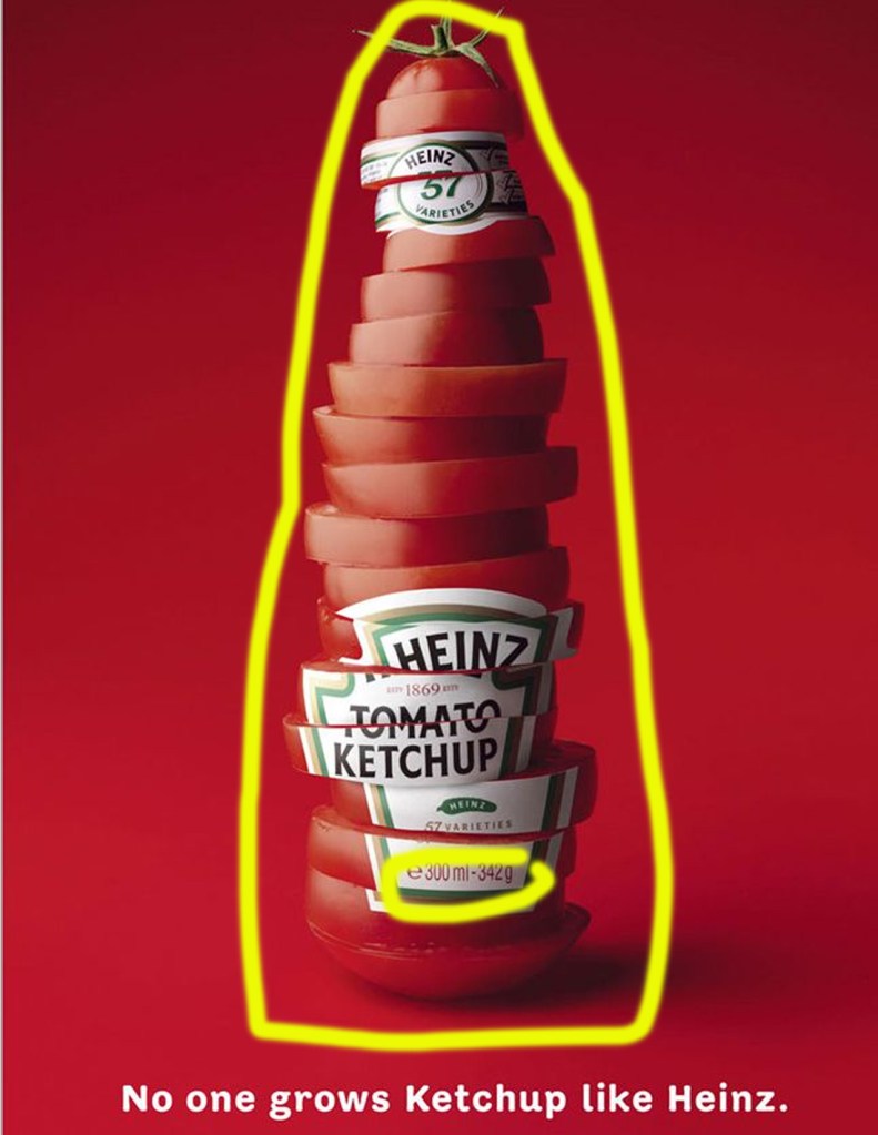
This ad utilizes complimentary colors red and green. Complimentary colors are ones that are directly across from each other on the color wheel. The red of the tomato slices compliments the green stem on top. The label also contains the green outline with red writing at the bottom of the label.
Typography
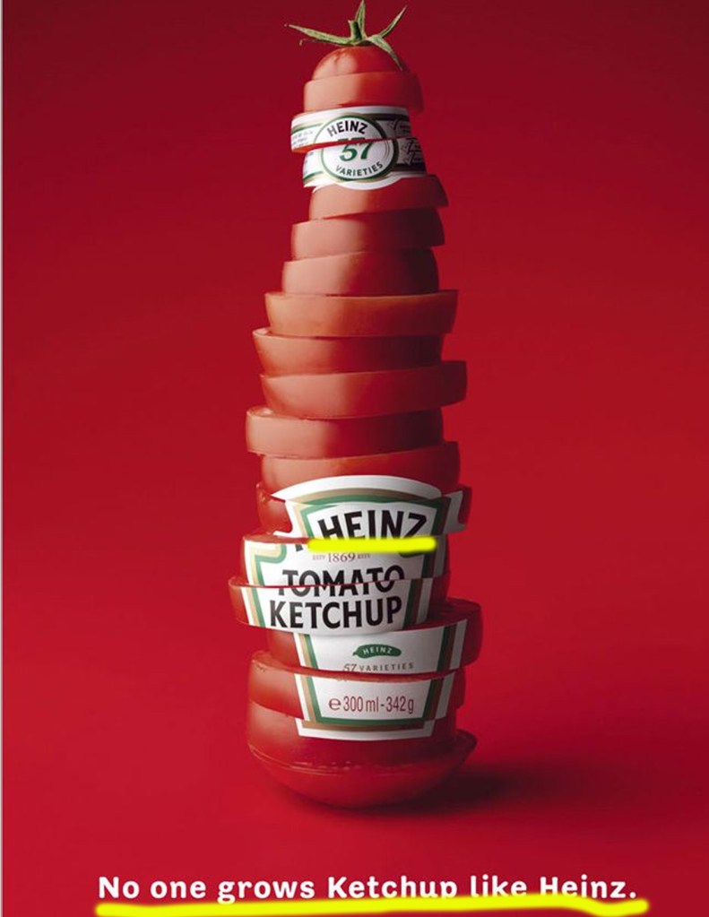
This ad uses a sans serif font in both the label and the line of text at the bottom. Sans serif means that there are no serifs on the ends of the strokes of the letters. This type also has the same thickness all the way around.
My Ad
Attribution
- Logo Source: https://www.stickpng.com/img/icons-logos-emojis/iconic-vintage-brands/heinz-logo
- License: Fair Use
- Heinz Bottle Source: https://images.unsplash.com/photo-1569790554690-1c0877b2fc6c?ixlib=rb-1.2.1&ixid=eyJhcHBfaWQiOjEyMDd9&auto=format&fit=crop&w=1065&q=80
- Photographer: Matt Popovich
- License: Public Domain
- Tomato Vine Source: https://images.unsplash.com/photo-1546094096-0df4bcaaa337?ixlib=rb-1.2.1&ixid=eyJhcHBfaWQiOjEyMDd9&auto=format&fit=crop&w=752&q=80
- Photographer: Alex Ghizila
- License: Public Domain
Repetition
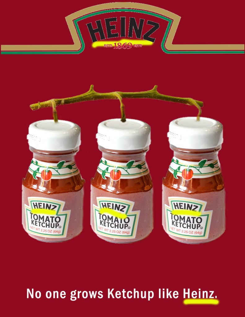
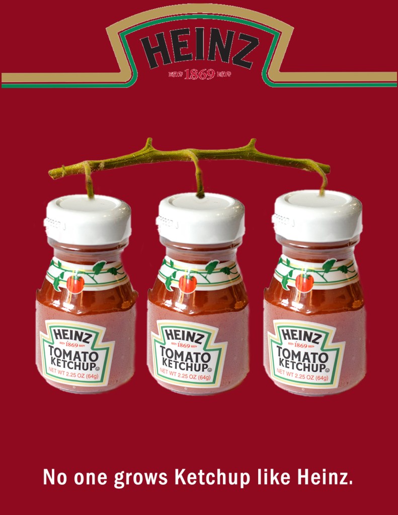
I also chose to repeat the word Heinz throughout the ad by having multiple bottles of ketchup growing on a vine. Instead of just seeing the word three times like in the original ad, you can now see it five times.
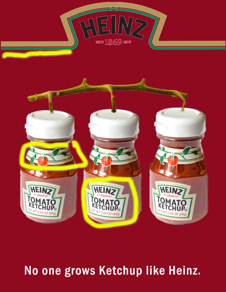
I continued the use of red and green complimentary colors, but a new addition was the little tomato on the bottle. The green from the logo also compliments the red background.
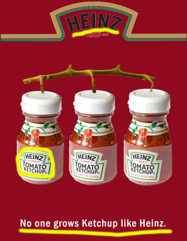
My ad also uses a sans serif font. It is not the same as the original ad, but it is pretty close!
I really enjoyed this assignment because it allowed me to imagine what an ad I would make would look like to go with a well known company. I also enjoyed analyzing their design techniques and incorporating some of them into my own.

